| Current Results |
| LEARNING FROM SELECTED EXAMPLES Each of the events in the prediction registry is included in the overall summary of current results as soon as it is possible to make the calculations that comprise the formal hypothesis test. There is likely to be something interesting about every case, but examining all of them in full detail would be prohibitive. A selection of a few examples will provide some indication of the range of outcomes, and show what the data look like over the period of the prediction and how the the formal analysis represents the data. Some of these examples, the Yugoslavia Bombing, New Years, the Turkey Earthquake, have been treated comprehensively, with various analytical approaches and examination of "control" data to provide context.
(Note: the following links go to pages with
multiple graphs, and require some downloading patience.) But first, a brief discussion of the purpose of the experiment, the nature of the data, and the primary analytical strategies: The experimental hypothesis is that otherwise random data recorded during extraordinary global events will be slightly less random, resulting in an unusual deviation above or below the expected mean value. The fundamental elements in the measurement technology used by the GCP are the trials that make up the ongoing sequence of random events. When the random sequence is undisturbed, the trial deviations are symmetrically distributed around the mean, and an accumulation of the deviations over time will look like a random walk, with unpredictable excursions wandering above and below the mean, but no obvious trend. In contrast, if the sequence of data points is even slightly correlated with some other variable, the random walk will become less random, and take on a trend with a slope that corresponds to the strength of the correlation. The terminal value of such a cumulative deviation represents the "bottom line" for the question whether the correlation with the defined global event is significant according to the appropriate statistical criteria.
A useful format for displaying the data corresponding to the formal hypothesis
plots the cumulative deviation in comparison with an envelope that shows the
probability that the deviations are just random fluctuations.
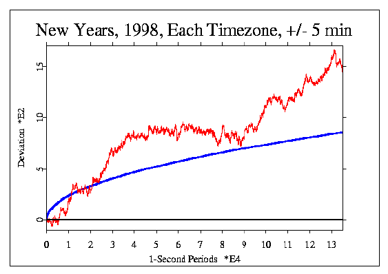
The following figure is an example. A horizontal line at y = 0 shows the expected
value for the deviations. The irregular, jagged line (red) is the random walk generated by
the data, which shows a strong trend overall, but some smaller
segments with relatively flat
slopes. The smooth, parabolic curve (blue) represents the widely used standard for
statistical significance at p = 0.05. In this case, the data
far exceed this criterion; the probability for the total deviation is
0.0031. |