| Current Results |
| BOMBING
IN YUGOSLAVIAOn the 24th of March, 1999, at 1900
hours, UTC, NATO
began bombing in Yugoslavia, with the mission to stop the ethnic cleansing in Kosovo,
fostered by the Serbian regime of Slobodan Milosevic. Although warnings and threats of
such an action had been increasing in seriousness, this was shocking and frightening to
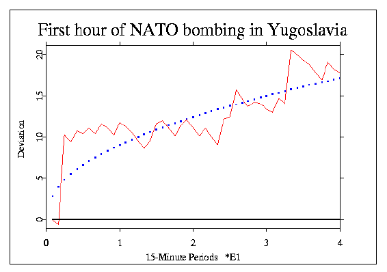
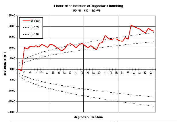
the world. The prediction was made that the first hour of the bombing would correspond to
a significant deviation in GCP data, and a hand calculation using 15-minute Z-scores
indicated a thought-provoking outcome with a low probability that it was just
chance fluctuation. The graph below shows the cumulation over the 48 data segments
representing the deviations of the 12 eggs running at the time
during four consecutive 15-minute blocks.
The cumulative deviation of Z˛ (Chisquare) relative
to expectation (black line) for
the first hour of the bombing shows
a significant trend (the jagged red line), culminating with
Chisquare = 65.746 on 48 degrees of freedom, associated with a chance
probability of p = 0.045. The dotted blue curve shows the p = 0.05
"significance" envelope for the Chisquare as the number of degrees of freedon increases.
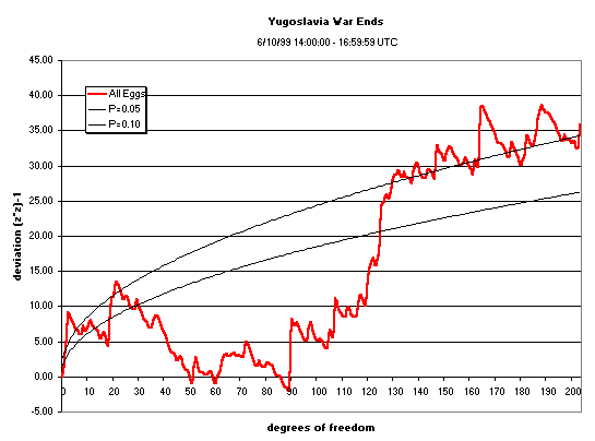
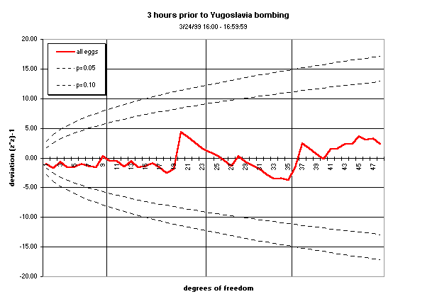
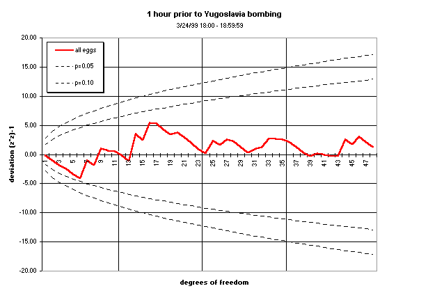
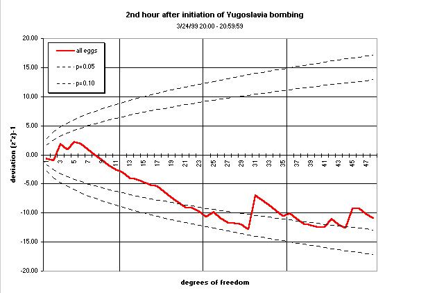
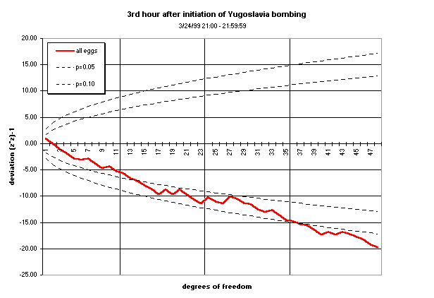
The one hour period at the beginning of the war represents our formal prediction, and it does indicate that the GCP data might be reactive to the focused attention of the world on this event, with probability of 0.045 that the deviation is just chance fluctuation. Similarly, formally designated prediction for the three-hour period encompassing the public acceptance of terms at the end of the war shows a significant deviation (p = 0.042). A natural question is what the surrounding data look like, especially at the beginning of the bombing. George deBeaumont (who also hosts egg 109) focused on this question in an independent look at the data. The following graphs show the data for three hours prior to and following the beginning of the bombing, and they tell an interesting "story". Is it a coincidence that the data in the first three figures are a classic representation of the "calm before a storm"? They show practically no movement away from chance expectation, whereas all three of the graphs for the hours after the bombing began show large deviations.
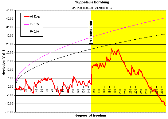
The following figure shows the 6
hours in sequence, and provides another perspective on the
difference between the time just prior to and just after the
beginning of the shooting war.
Curiously, the raw deviations in the 2nd and 3rd hour after
the bombing began are not larger than expected, but smaller. We have
little experience interpreting deviations in this direction, but these
are impressively strong, and may be meaningful; a similar trend occurs
in the data corresponding to the Littleton, Colorado school shootings.
(The figures assessing the context of the first hour of
bombing were produced by George deBeaumont.)
It is tempting to look at the fine details of such
graphs as these as a meaningful representation of the corresponding events, but the
formal test of the hypothesis of correlation between the specific global event and
the experimental data is the computed Chisquare. The specification for this analysis was 15-minute
segments, but we have undertaken an
exploration of the effect of the segment length, to see whether there
might be an optimum block-size for the computations -- one might think of it as a global consciousness
unit. As it happens, the 15-minute block-size shows a stronger and more consistent trend than shorter
units. As for the story told by the primary graphs, not
only do both of the formally designated segments (for the beginning and the end of the war)
show an overall trend
which is statistically significant, the graphic displays of data taken
during the beginning of the bombing can be
interpreted as an appropriate reflection of the dismay
and concern generated by this major outbreak of war activity in the
world.
As George observes, "The emotional analogy is striking (3 hours
of calm, 1 hour of shock, followed by 2 hours of despair)."
We are, of course, aware of the pitfalls of interpretation in this area,
but speaking for myself as a person for whom both objective and
subjective aspects are important, I see the correspondence
of data with world events
linked in this way as an obviously appropriate story, with profound meaning.
(June, 1999, RDN).
|